Onboarding articles (5 articles)
Series of Help Center articles created for users who wanted to learn how to use deepdivr on their own. This series contains 5 articles that explain the basics of using the platform.
After publishing these articles, the onboarding completion rate was 20% higher.
I was responsible for:
- Article copy
- Visual
- Publishing (Intercome)
Create an account and connect your platforms
Executive summary
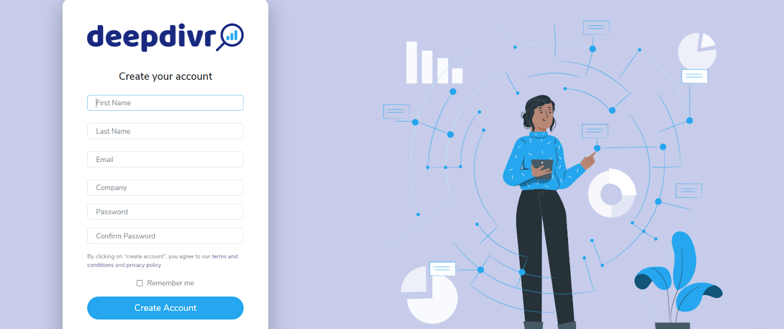
- Create your company account on
👉 https://www.deepdivr-app.com/users/sign_up - When logged in, go to Settings on the left side. Connect to your integrations
- Create your first account and add your Ads Manager accounts (connections)
- Next article 👉 Create a dashboard
Create an account and connect your platforms
Two types of accounts
You'll have to fill out a short form with your login details to create an account. The form contains only 6 fields: first name, last name, email, company, password, and confirm password.
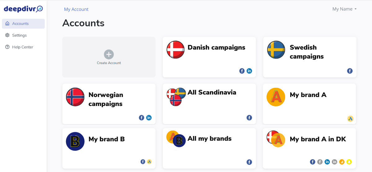
Once you login into the platform, you'll see the option for creating an account. You might be wondering why we'd ask you to make an account again? There are two things called accounts. One is the login account that you got after filling out the form. This is your company's account on deepdivr for all users to log in to.
The second account can be understood as a folder for your channels. A channel could be an ad account, organic page, or analytics view. The account (folder) can have one or more channels in it. You can also have multiple accounts (folders) containing the same or different channels. This, of course, depends on the structure that you feel comfortable with.
Based on your requirements, you can choose to group the FB ad account, LI ad account, FB organic page, Google analytics view, and Google ads account. For example, you can review your performance for a specific country or a brand across all platforms by grouping all the channels together in one account (folder). You can also choose to have just one channel in your account to view only the performance from a single platform.
By grouping them, you can get quick access to a master overview of your key metrics like spend, reach, impressions, and so on for the selected countries. A huge advantage is that you can compare your metrics cross-platform, which means that if you're running campaigns on Facebook, LinkedIn, and Google Ads (among others), you can see your key metrics for all of them combined.
Connecting your advertising platforms
When you open deepdivr on your desktop, you'll see three tabs on the left side of your screen - accounts, settings, and help center.
To connect your platforms click on Settings. The first options you should see are platforms. Here you have a list of platforms you can connect to. Deepdivr connects the advertising platforms through an API. So the connections that you make here are on an account level (login account). This means you'll be able to connect them to as many accounts (folders) in deepdivr as you find necessary to create.
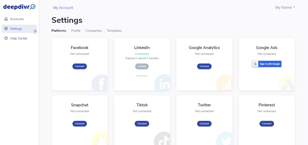
Once you have connected a platform, you can select which deepdivr accounts it should be visible in. So this means that you can choose how many platforms you want to connect to each account you create.
Create an account
When you click on Create Account (folder), you have to name it, which should be something that you and other users can quickly recognize. A pro tip is to decide on a structure for your naming and use it consistently across accounts, especially if you're using multiple accounts.
Then you can choose to upload a logo or an image that can help you recognize the account even faster. On a side note, it will make your account and dashboard nicer to look at. You can also choose to select your own brand's color, making it much easier to show the visualizations to your stakeholders without manually changing each one. Then click on Save Changes.
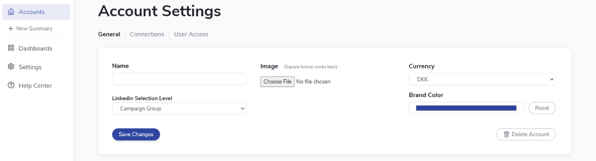
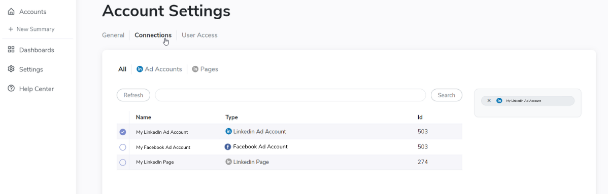
The last step for finalizing your account is to connect channels to this specific account (folder). Right under the title Account Settings, you'll see a column called Connections. Once you click on it, you'll see a list of your ad accounts on the native platforms. This list is generated after you made the initial platform connection in the previous step. So, for example, if you have multiple Facebook ad accounts, you can connect one, several, or all of them to your account (folder) in deepdivr. It gives you the possibility to organize your ad accounts in the exact way you want to.
Simply click on the checkbox of the ad account you want to include in this specific account (folder). You can open your newly created account by clicking on Accounts on the left side of your screen. Afterward, just click on the account you created.
Onboarding articles:
Create a dashboard
Part 2 of 5: How to get started with deepdivr
Executive summary
- Click on + New Dashboard and select either manual or automatic
- Manual 👉 Find your campaigns in the table. You can speed up the process by choosing only relevant platforms, selecting a specific time range, or by searching for the name in the search bar
- Automatic 👉 Select only the relevant platforms, choose a specific time period, if needed, include a keyword
- After choosing your data, click on View Dashboard in the top right corner
- Next article 👉 Create a tab
Create a dashboard
In the previous article, you've read how to create an account and connect your advertising platforms to deepdivr. In this article, you'll learn how to create a dashboard.
Before we move to create a dashboard, it is essential to say what it actually is.
A dashboard is a visual display of all your data that provides information at a glance. In deepdivr, a dashboard can be split into different tabs, making it easier to navigate and organize your data. When you click on a tab in your dashboard, it will show you all the widgets (visuals) of the data you want to monitor.
For example, your account can focus on your campaigns in Denmark, Sweden, and Norway. Once you click on that account, you can have separate or grouped dashboards for each country, and in each dashboard, you can have tabs focusing on different objectives - traffic, conversions, etc.
*In hindsight - your account (folder) is a collection of your dashboards. Dashboards are collections of your tabs, and tabs show you all the different widgets (graphs) of metrics that you want to monitor.
How to create a dashboard
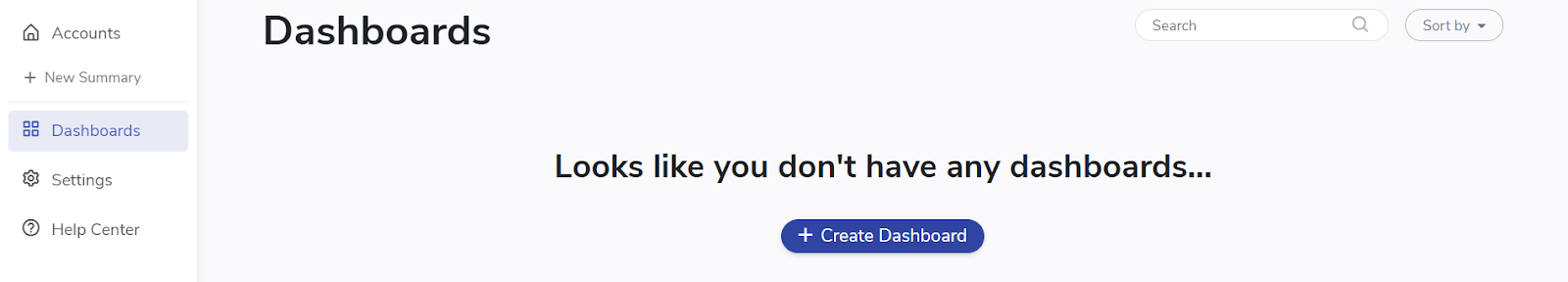
After creating an account, you'll be shown a screen that tells you there are no dashboards. Once you click on Create Dashboard, you'll see a list of campaigns, views, and posts available within the selected ad accounts, pages, and views you have connected to the account. You can see and edit the metrics shown for each item - it looks similar to an ads manager, but no worries. This is not the final visualization.
Your dashboard will automatically generate a name as “Unnamed Dashboard #(id number).” We’d recommend changing it into something that’s more recognizable to you. Simply click on the Rename button next to the dashboard’s name.
You'll notice two options for creating your dashboard on the top of your screen - either manual or automatic.
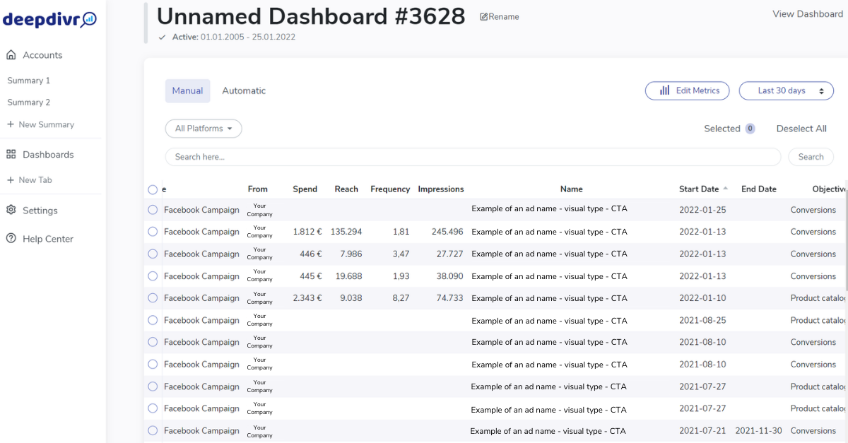
Manual dashboards
To manually create a dashboard, you need to select one-by-one all the items you want to visualize. There are several ways you can make this easier for yourself.
The first one is to organize your naming convention in your ads manager to make it easy to recognize your campaigns.
You can also filter the platform or platforms you want to include in your dashboard, depending on whether or not you wish to monitor cross-platform. Afterward, you can select the period of time when you were running your campaigns. Just by using these two filters, your job of searching for the specific campaigns will be much faster.
If the list is still too long or the filters above don't apply to your case, you can use the search field. Search for a specific name or keyword from your naming convention, or you can use other indicators such as objective. When you click on the Objective, all your campaigns will align based on their objectives. This means that all brand awareness campaigns will be grouped under each other, all conversions will be under each other, and so on.
Once you’ve made your selection, click on the View Dashboard in the top right corner of your screen.
Automatic dashboards
Automatic dashboards are great to use in two scenarios. One is when you need to group a lot of data from the past. For example, all your campaigns from last year. Or, in the second scenario, when you want a dashboard to automatically be updated in the future. For instance, if your new campaigns will include a specific keyword that you set as automation, it will automatically go into that dashboard. The precision of this option depends on how specific your naming convention is.
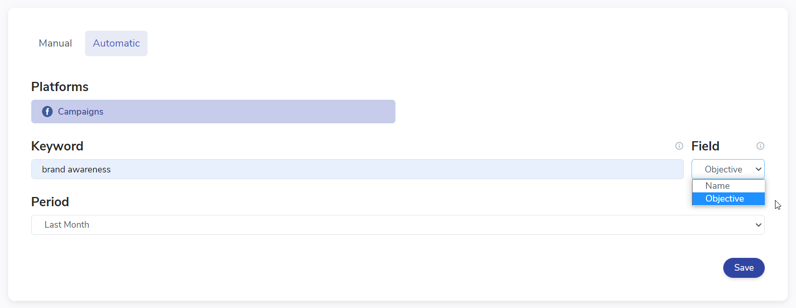
Here is how you can set it up.
The first thing you can select is the platform that should be included, considering whether you want to monitor cross-platform or not.
Then comes a selection of a keyword and the field where the keyword can be found. For example, if your naming convention is specific (e.g., it contains the name of a product), you can select the Name field, and your keyword could be the product's name. Or, if it makes more sense for your case to select based on objective, you can use the Keyword field similarly.
Afterward, select a period of time and click Save. The platform will include all the campaigns that contain that specific keyword in the particular time period you chose in this setting. You can have more than one automation in a dashboard. So if your naming convention is different on Facebook than on LinkedIn, or if you simply want both campaigns with 'name A' and 'name B' in your dashboard, simply click + Create Automation (top right screen). Then go through the steps above again, and add more automations before creating the dashboard. Once you have added one or more automations, click on the View Dashboard to monitor your campaigns.
The switch on/off button called Fully Automatic may come in handy when you’re dealing with a changing time - this month, this year, last month, last year, etc.
So, this means if you want to have automation that will consistently show you every time all your data from Last Month (month after month), this is the way to do it. Let’s break it down in an example.
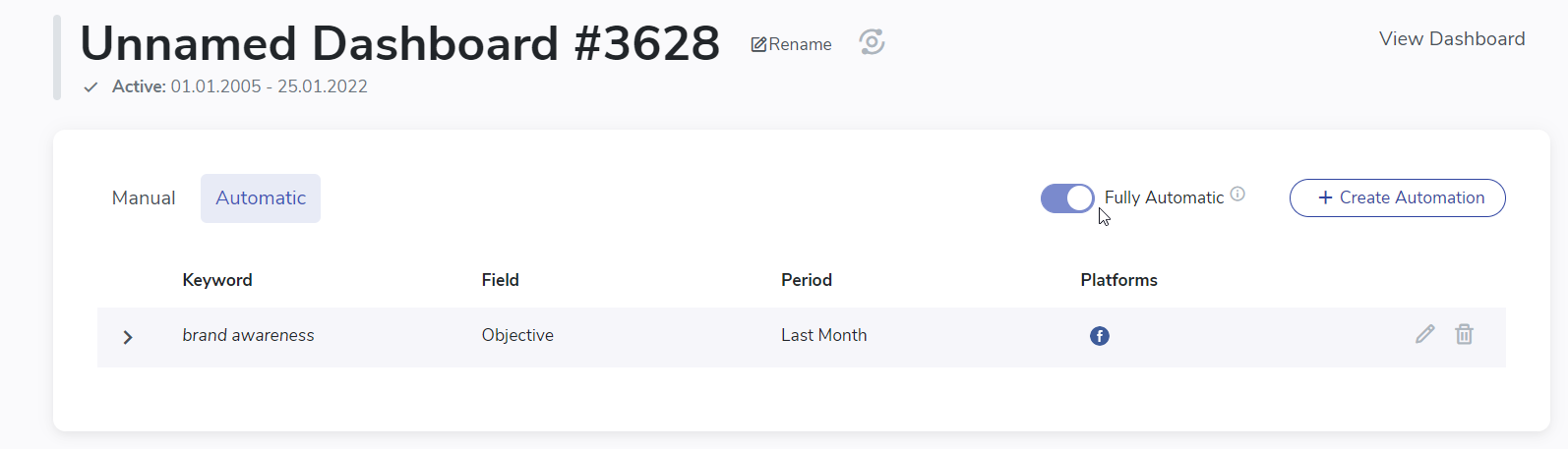
Let’s say that every month, you want a fresh new report on how your campaigns performed the month before. Imagine that the current month is April. This means the Last Month rule will include your campaigns from March. When the month passes to May, the rule of the Last Month will automatically jump to April. That’s a no-brainer. But here comes the trick.
If the Fully Automatic button is disabled, your dashboard doesn’t know it should remove the campaigns from March. So what happens is that you’ll end up with a dashboard that includes both March and April. And each month, it will only add more campaigns from the passing months.
When you enable the Fully Automatic, you’ll tell the dashboard to show you the campaigns only from the Last Month. It means that the dashboard will automatically remove the campaigns from March, and you’ll see only the campaigns from April. And every month, the dashboard will remove and add campaigns that match the rule Last Month.
So instead of every month creating a new dashboard all over again, you can have a dynamic dashboard that will automatically update itself.
Onboarding articles:
Introduction to tabs
Part 3 of 5: How to get started with deepdivr
Executive summary
- Click on the + New Tab on the left side of your screen and start creating widgets.
- Use default tabs as a way to break down your dashboard into more specific sections. You can use them to better organize your widgets.
- Ads tab shows you a view of your ads you created for your campaigns in ads managers that you connected to deepdivr. You can sort them based on a metric that is most relevant to you.
- Table tab gives you an overview of your campaigns, ad sets, and ads that you selected for this dashboard.
- Filter tab allows you to group your data from your campaigns, ad sets, and ads in multiple different ways. You’ll find out that you can group the data in a way that native advertising platforms don’t allow you to.
- Next article 👉 Organizing widgets
Introduction to tabs
The next step after creating your dashboard is to make your first default tab.
Before creating a tab, let's define what the tab is. Since a dashboard is a collection of your campaigns, tabs are a way for you to break down the data into different groups. The final layer is the widget (graph), representing the metrics you want to visualize. Okay, there were a lot of terms that may be confusing. Let's see how it actually works.
For example, your account (folder) can include all your ad accounts and pages in Denmark, Sweden, and Norway. Once you click on that account, you can have four different dashboards; one for each country - DK, SE, NO, and one for all of them together.
Within each dashboard, you can have a tab for each objective - or each part of the funnel you are advertising - branding, traffic, conversions, etc. In each tab, you'll finally have the actual widgets, such as the graph of your link clicks, spend, etc.
But a dashboard with just one campaign could also benefit from having different tabs. You can set one tab as an overview for the entire campaign's performance across the relevant metrics, one tab for analyzing target groups, and a third tab for analyzing creatives. All levels (account, dashboard, tabs, widgets) are fully customizable to your needs.
So how do you create a tab?
On the left side of your screen, you can see the menu option. All dashboards have 3 defaults: Ads, Table, and Filters. Besides these 3, you can add as many tabs as you want. You can simply click on + New Tab and start with setting up widgets with metrics that you want to measure. Of course, you can also create multiple tabs at once by applying a template. But let's talk about that in the article about features.
Let's look at them closer.
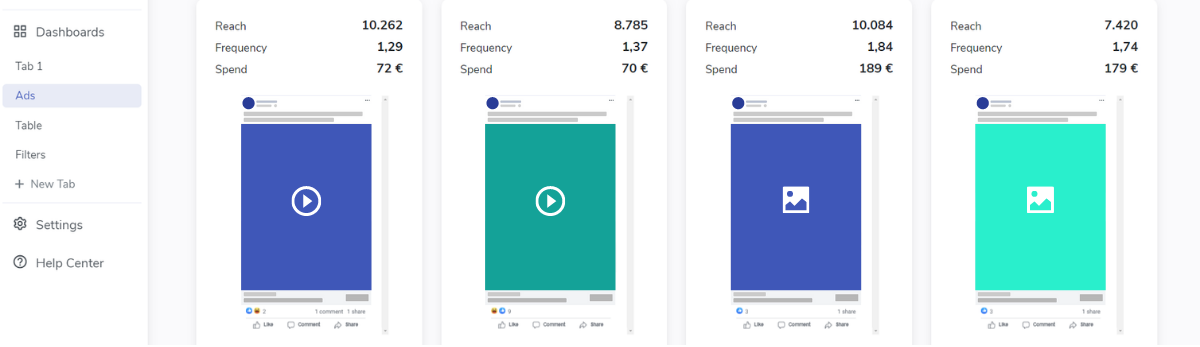
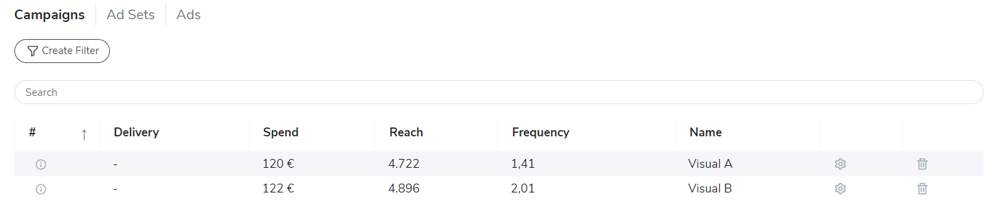
Ads
In your ads tab, you can see all the ads in the campaigns you selected for this dashboard. Besides seeing their visual and copy snap, you can see their performance. There are 3 metrics selected by default: reach, frequency, and spend.
You can, of course, edit that on the 'Edit metrics button' to show the metrics relevant to you. After adding the relevant metrics, you can sort your ads by any of the selected metrics to see the best-performing ad. Simply click on Sort by and choose a metric. The ads will be ranked in descending order.
Table
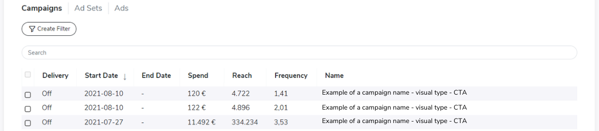
In the table tab, you can see the campaigns that you selected earlier in a very "ads manager" view. The structure of the pages is the same as when you're creating campaigns in Facebook's ads manager - you can click through campaigns, ad sets, and ads - or campaign groups, campaigns, and creatives for LinkedIn.
One way of using this tab is to get a quick view of different campaigns’ performance. You can select the metrics that are relevant to you. Simply click on Edit Metrics on the top right corner of your screen. When you’re done, Save Metrics and you’ll see your adjustments in the table.
The other way of using the table tab is for you to create the necessary filters to make your campaign monitoring more effective. So let's cover that in the filter tab.
Filter
This is where the real magic happens!
We can agree that filters don't sound super exciting. But that's because you haven't tried the deepdivr filters.
Filters allow you to group your data in other ways than the usual campaigns, ad sets, and ads let you. And since we're all about data, you can view the performance within these groupings. This can give you entirely new insights that are almost impossible to get in any other way.
Not convinced yet?
Imagine having a campaign with, e.g., 4 different target groups or ad sets. Within each target group, you are testing 3 different creatives - a short video, a longer video, and an image. Let's spice it with 2 different CTA buttons as well. This gives you 4*3*2 = 24 ads. While it's easy to sort and find the one ad that gave you the most conversions or clicks, this doesn't say anything about which of your creatives actually performed the best. If you group the creatives into 3 filters - 'short video,' 'long video,' and 'image' you will get the real picture of which creative was the best. This can be used for endless different things, and we promise it will give you new insights that you would not get when analyzing each ad or campaign on its own!
Not sure how you can benefit from grouping your data? Check out this video about Simpson’s paradox. It will show you what you might be missing out on. Watch video →
Examples of what you can filter:
- Objectives (brand awareness, Link Clicks, Video Views, etc.)
- Target groups (lookalike, retargeting, broad audience, etc.)
- Ad formats (single image, video, carousels, etc.)
As you may have guessed, the filter tab shows you the list of filters that you created. You can create filters from either the table tab or filter tab - it will direct you automatically to the table tab. The first thing to do is check the box for campaigns you want to include in your filter. Then just click on the Create Filter. After adding your name and saving, you'll have the filter ready for you to use.
The way you use it is explained in the widgets article. In short, you'll be able to track metrics for each filter that you create in a widget. This means you can track the data based on your 'creative filter.' For example, is the most link clicks you want to monitor for your creatives filter? Is it the spend you're curious about for your creatives?
If you need to track more data on an Ad set level, you can do that by creating a filter when you're on the Ad Sets page. For example, you can select the campaigns that had a specific target group and create a filter based on that.
Onboarding articles:
Organizing widgets
Part 4 of 5: How to get started with deepdivr
Executive summary
- Click on the + Add a Widget
- Add a Results widget - get an overview of your key metrics
- Add a Development widget - see your campaign's performance over time
- Add a Breakdown widget - get a detailed breakdown of your data
- Add a Key Insights widget - shows you your best-performing indicators
- Add a Notes widget - leave a note for yourself or your colleague
- Add a Campaigns widget - compare your different campaigns against each other
- Add a Filter widget - see your data in a way you grouped them (e.g., link clicks/ad’s visual variations)
- Next article 👉 Features in the dropdown menu
Organizing widgets
Widgets are different visual representations of your actual metrics and KPIs. They can have the form of various charts (line, pie, bar, etc.), different sizes (half column, full column, etc.), a summary of your results and key insights in a graphical way, or you can use the notes widget to leave some notes for your colleagues or stakeholders.
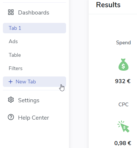
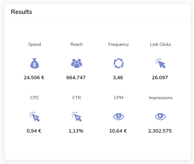
Which widget you decide to use is entirely up to you, but keeping it neat and organized will save you a lot of time in the long run. The way you can go about it is first to have widgets that will show you if your campaigns are performing according to your goals. To do that, use the Results widget.
Results widget
Results widget lets you immediately see the results of a few key metrics. The fun begins when you add benchmarks to this widget. By doing so, you'll be able to see how your results compare to a previous comparable campaign. Or to the goals you have set for yourself in the campaign. It helps to quickly see if you're on the right track. You can check this article to see how to apply benchmarks in deepdivr.
It's important to note that you can sometimes see a "-" symbol for reach and frequency when you're monitoring across ad accounts or platforms. The reason is that reach and frequency are unique to each account. The other metrics are displayed with numbers even when measuring across ad accounts.
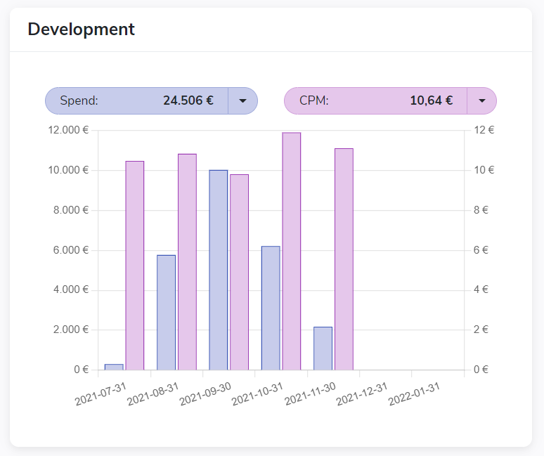
Development widget
To see how your metrics are performing over time, use the Development widget - e.g., you can see how your CPC has been evolving since the beginning of your campaign. Has the CPC been steady? Has it increased or decreased?
You can decide whether you want to measure only a single metric or two metrics in one widget. Tracking two metrics is the maximum you can track in one widget at a time. You can, of course, build several development widgets at a time and view them side by side.
There are several ways you can use this feature, but one of the most effective is to compare costs and rates. For example, it can be CPC vs. CTR, where you would want to have both lines develop at a similar pace. If CPC keeps increasing and your CTR keeps decreasing, you may want to consider optimizing. Check this article for more tips. Read how to apply 2 metrics in one widget →
Development widget gives you an overview of your campaigns. Use it to quickly decide whether you don't need to do anything with the campaigns or if you should spend more time on them.
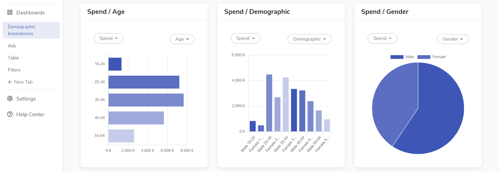
Breakdown widget
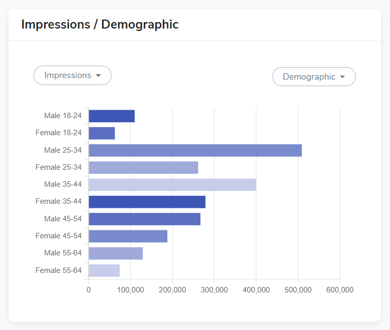
To dive deeper into why your campaign performs the way it does, you can use the Breakdown widget. You can get different breakdowns based on the platform you're using. For example, if you're monitoring your LinkedIn campaign, you can get breakdowns for company size, industries, job titles, seniority levels, etc. If you're monitoring Facebook campaigns, you can get a breakdown of demographics, age, gender, placements, and so on.
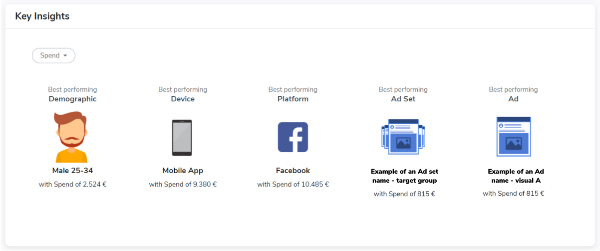
Key Insights widget
A widget that will help you to see the best performing indicators immediately is called Key Insights. This widget takes all the data from your campaign(s) and, based on that, displays the best performing demographic, device, platform, ad set, and ad for a metric of your choice. Please note; conversion metrics are not available for demographics.
This widget is often good for sharing with colleagues or managers who need an easy overview.
Notes widget
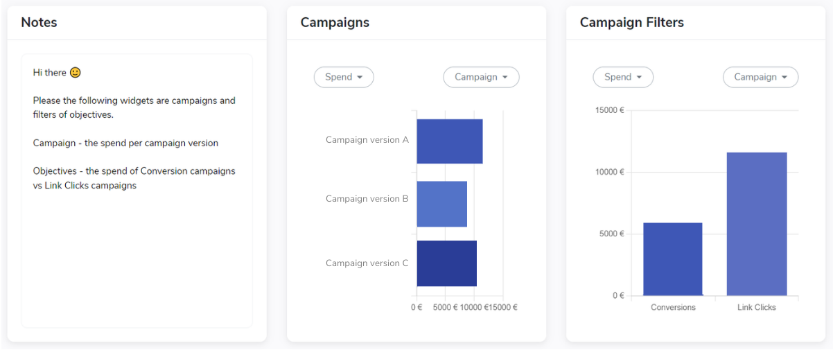
When sharing the dashboard with colleagues who are not involved in setting up your deepdivr account, you can explain how to read the dashboard in the Notes widget. For example, if you're sharing the report with your shareholders or managers, you can explain what the numbers mean. You can also use the Notes widget as your log - if you optimize your campaigns, e.g., by adding or removing target groups or creatives. It's beneficial for you to see when you changed things and what you changed - especially when reviewing the impact of your changes.
Campaign widget
When you're running multiple campaigns and comparing them based on a specific metric, you can use the Campaign widget. For example, if you want to know which one of your campaigns had the highest spend, you can look at it with this widget. To make the most out of it, you can include the widget more than once in your tab, where you can compare the spend and the primary metric that your campaign was optimized for. Seeing it side by side can give you exciting insights.
Filters widget
Once you make filters in your tab called Filters, you can use them to create widgets. In this widget, you need to select a metric and then the level of your filters - whether it should track your campaign, ad sets, or ads filters. It's important to note that the widget will show you all the filters in the selected level. (e.g., if you have 10 filters in your filter tab, the widget will show all 10 campaign filters. The same goes for the filters on your ad sets and ads level)
Onboarding articles:
Features in dropdown menus
Part 5 of 5: How to get started with deepdivr
Executive summary
Two dropdown menus:
a) affects dashboard or tab
b) affects widgets
a) dashboards and tabs
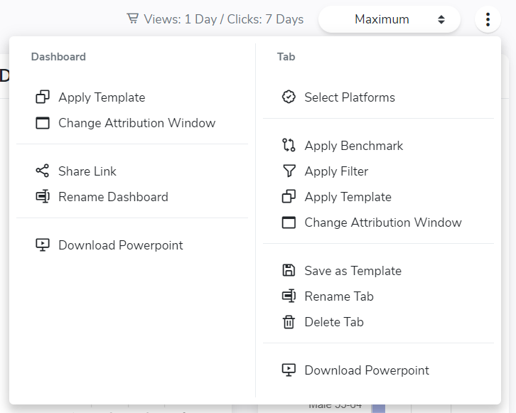
- Click on the 3 dots that are on the top right side of your screen
- You'll see a dropdown menu split into 2 sides
- left = features affecting dashboard
- right = features affecting a tab
b) widgets
- Each widget has a "settings" wheel icon in their top right corner
- Click on the icon and choose a feature you want to apply to that specific widget
- Some features are unique to specific widgets
Features in dropdown menus
When you're in your dashboard, there are two dropdown menus where you have a selection of several features. The first dropdown affects the dashboard and tab level. The second applies changes on a widget level.
The first dropdown menu is on the top right side of your screen, right above your widgets. This menu is split into two halves - a dashboard on the left side and a tab on the right.
Dashboard and tab features
Let's start with the left side - features for your dashboard. There are 5 in total.
Apply Template
The 1st feature is Apply Template. When you click on it, you see a popup window. Here you'll have the option to choose between different objectives. After you click Apply, the platform will generate pre-made tabs with metrics designed by our senior ad specialists. You can keep the whole template as it is or take it as an inspiration. Remember that all the tabs you had before in this dashboard will be replaced after you apply a template.
Change Attribution Window
The 2nd feature is Change Attribution Window. You can see your current attribution window on the left side next to this dropdown menu. The default setting is the same as it is on Facebook - 7 days click, 1 day view. If you need to change it, you can do so in this feature.
Share Link
The 3rd feature is Share Link. After you allow to generate a URL link, you can send it to whoever you want. They will be able to see the tabs you created and your Ads tab, but they won't be able to make any changes. It's strictly for viewing purposes only. You can use this when you need to send a quick update to your manager without spending time downloading it and sending it over. You can also turn off the sharing button when you decide to do so.
Rename Dashboard
The 4th feature is Rename Dashboard. You can rename your dashboard whenever you need to. It's always better when you're more specific in the name than too broad. Also, it will help you find the dashboard you need much faster.
Download Powerpoint
The final feature is Download Powerpoint. You can download the whole dashboard as a PowerPoint presentation. All widgets are generated as tables that you can further edit in ppt.
On the right side of this menu, there are 9 features that you can apply on a tab level.
Select Platforms
The 1st one, Select Platforms, will let you choose which platform's data this tab should display. If you don't select anything, all platforms that you have selected will be displayed.
Apply Benchmark
The 2nd, Apply Benchmark, lets you set up a benchmark that will be shown in your widgets as a comparison number to your current results. You'll have 5 options for setting up the benchmark.
- Select your other Dashboard as a benchmark
- Choose different periods
- Select your filters as a benchmark
- Benchmark your different accounts
- Set up manually the numbers for different metrics that you want to use as a benchmark
Check out this video to see in detail how to apply benchmarks →
Apply Filter
The 3rd feature is Apply Filter. If you created a filter, you could apply it to your entire tab - e.g., to split up your performance and see a specific campaign or objective on its own.
Apply Template
The 4th feature, Apply Template, works on the same principle as what you read about before. Once you click on it, you will see a popup window. There you'll be able to select between different objectives. Once you hit Apply, the platform will generate a tab designed by our senior ads specialists. It's important to note that once you apply the template, all the widgets that you had before in this tab will be replaced.
Change Attribution Window
The 5th feature is Change Attribution Window. Similarly to changing the attribution window on a dashboard level, you can change it here only on a tab level. This means only this specific tab will have a different attribution window if you decide to change it.
Save as Template
The 6th feature is Save as Template. This means that you can save the tab and use precisely the same settings in different tabs, dashboards, or accounts. So, for example, you can track several campaigns in different deepdivr accounts without creating the same tabs all over again.
Rename Tab
In the 7th feature, you can Rename Tab. You can do so at any point. The best approach is to be specific.
Delete Tab
In the 8th feature, you can Delete Tab. Remember, deleting your tab is permanent. So you won't be able to retrieve it if you delete it.
Download Powerpoint
The last feature is Download Powerpoint. You can download your tab as a ppt where all the widgets are in a table format. You can further edit them in ppt if you need to.
Dropdown in widgets
The dropdown menu in widgets can differ in the number of features that apply to a specific widget. In addition, some features are unique only to one or a few widgets.
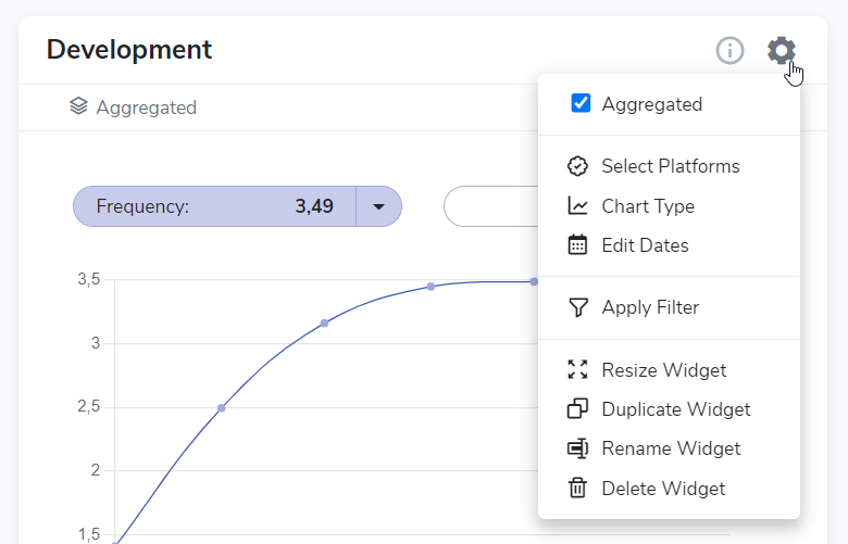
Aggregated
Aggregated - This feature allows you to see your data in an aggregated form. It's accessible only for the development widget.
Select Platform
Select Platform - You can select a specific platform. The widget will take the data only from the selection you make. This allows you to see the performance of different platforms side by side.
Chart Type
Chart Type - This feature is accessible only for development and breakdown widgets. You'll have 3 different options to display your data in each widget: Column, bar, and pie chart for breakdowns. For development, it's column, line, and area chart.
Edit Metrics
Edit Metrics - In the results widget, you can choose to display different metrics from the available selection. Unfortunately, the Reach and Frequency won't be visible if you're monitoring cross-platform. The reason is that they are unique to each platform.
Edit Dates
Edit Dates - You can edit the dates on a widget level instead of the whole tab. This is useful to compare different time periods side by side.
Edit Sorting
Edit Sorting - You can edit the sorting only in the Breakdown widget. You can select if the data should be sorted by category or metric. Furthermore, you can decide if the data should be in ascending (lowest-highest) or descending order. (highest → lowest)
Apply Threshold
Apply Threshold - If some data parameters you collected are significantly low, you can apply a threshold. The threshold counts as the minimum percentage that the data should reach for it to be visible. For example, if one of your age groups (e.g., 25-35) didn't reach at least 2% of clicks, the group won't be visible in your widget.
Apply Filter
Apply Filter - You can apply a filter on a widget level. This allows you to compare the performance of, e.g., a specific objective, a campaign, a group of creatives, or target audiences, next to either your overall results for the whole dashboard or to another filter.
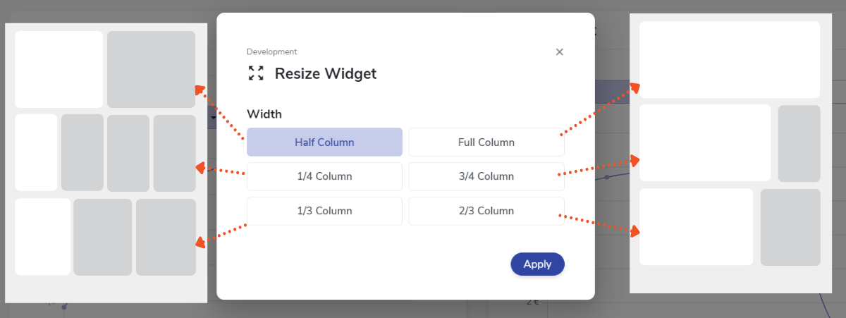
Resize Widget
Resize Widget - All widgets take half of a column in a default state. With this feature, you can resize them to take either a smaller or more significant portion of the space. Check this article to get some inspiration on how to use this feature.
Duplicate Widget
Duplicate Widget - You can create the exact same widget by duplicating the original one.
Rename Widget
Rename Widget - You can rename the widget to make it easier to understand what the widget is about.
Delete Widget
Delete Widget - Delete the widget if you don't need it anymore. Just remember, deleting the widget is permanent.
Congratulations on finishing the onboarding guide 🎉🚀
This is the last article from the self-onboarding saga. So if you’ve read all 5 you know how to work with the platform on an operational level.
While you know the basic functionality, it’s important to know when it makes sense to use which function. Or how you can set up an optimal dashboard for your objectives. Since there is no such thing as one size fits all make sure to drop us a message in the chat. We’ll make sure you’ll use the platform to the fullest potential.
Onboarding articles:
Shoot me a message if you're curious to learn more. I'm always up for a chat.
0 Comments Add a Comment?